The most successful typefaces, backed by science.
If you find yourself struggling with your business outreach, tirelessly strolling through Canva for the ultimate job-landing resumé template or simply want to keep up with what’s trending in design, this one’s for you.
After our exploration on the power of colour, typography is equally, if not more important to your brand and business identity; influencing the way we feel, how we perceive the brand andthe“personality” we associate it with. This explains why when we view serif typefaces, it tends to feel more traditional; with a formal tone, and is used in a business’ branding to say “I’m trustworthy and reliable.” In contrast, sans-serif typefaces tend to project a more easy-going aura with a friendlier tone, announcing “it’s all fun and games over here!”
Choosing the right typeface is one of the most important decisions in branding and web design, influencing your audience long before they read a single word.
Let’s start with the basics.
Though often used interchangeably, “font” and “typeface” do not mean the same thing and can have a lasting impact based on the one(s) you choose. A typeface refers to a type design; or the manner in which lettering is composed, and includes all variations of that design. For example, the popularly seen Helvetica is a famous typeface and a favourite amongst luxury fashion houses. Fonts, however, refer to the variations possible with a typeface. For example, Helvetica Bold, Helvetica Thin or Helvetica 10 pt, referring to the text size, are three different fonts.
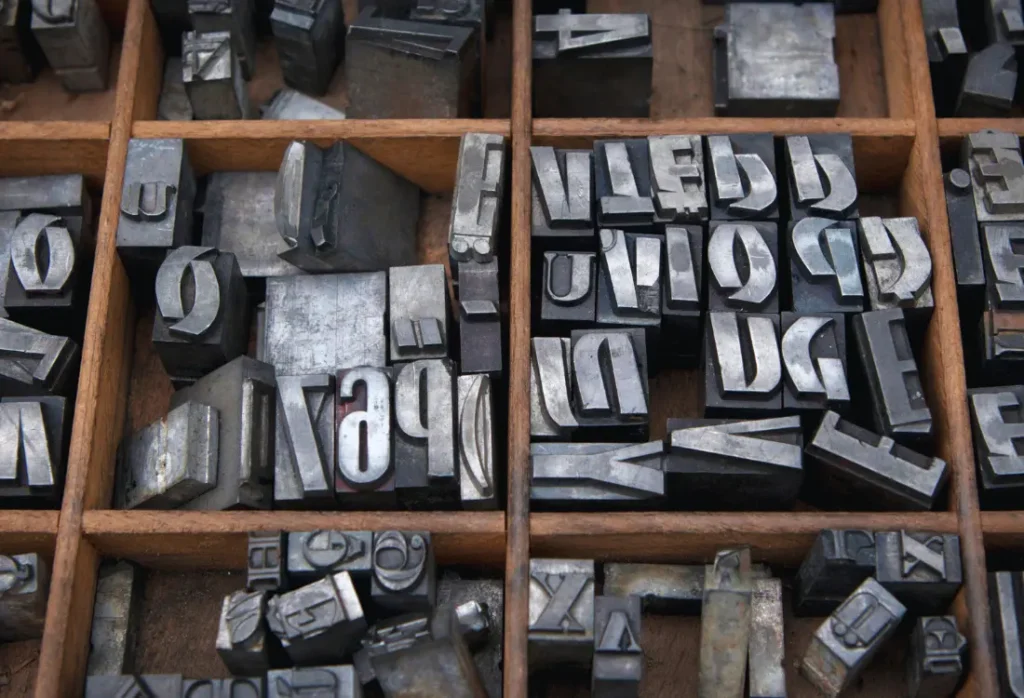
Generally, typefaces are characterised into two groups – serif or sans-serif. Serif typefaces are demonstrated with the delicate and strict strokes at the end of the letters, i.e.Times New Roman. Whereas sans-serif typefaces, as the name implies:“sans” meaning“a general absence,” are fonts without serifs, such as Arial.
Why it’s important to get it right.
In a study conducted on the readability of typefaces published by Dogusoy, Cicek and Cagiltay, found that overall sans-serif typefaces had improved legibility, aka readability by participants and were therefore easier to understand. However, within the same study, experts discovered that serif typefaces had higher retention rates; participants tended to focus on these for a longer period of time and when questioned, had improved memory about the text they were proof-reading. Conversely, a paper published in The Design Journal took it a step further and studied type outside the traditional use of serif and sans-serif, discovering the positivecognitive effects of using disfluent typography, finding that harder to read typefaces can improve learning conditions. Interesting, no?
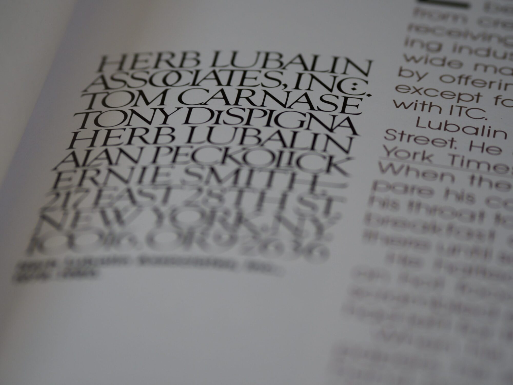
Here’s a compiled list of our favourite most successfully used typefaces and type family
Start byreflecting into your own brand or business’ typeface and see if it’s in-line with your aspiring brand identity and message. Here at ICON, we use a sans-serif typeface of choice that accurately represents our brand’s identity; youthful, friendly and inclusive, with a hint of formality.
These examples each represent a different approach to style, readability and brand personality.
Futura
If it’s good enough to be on a plaque on the moon, it’s good enough for us. Invented by German author and designer Paul Renner in 1927, the sans-serif Futura typeface quickly grew to be the most influential typeface of the 20th century. The retro-futuristic type has been used across industries, most notably film and media, and is the go-to typeface for advertising.
Baskerville
Designed by John Baskerville in the 1750s, the Baskerville serif typeface exudes elegance with a hint of mystery. Rightly so, as according to user interface expert Bishop, this typeface is “excellent for book design — and it is considered to be a true representation of eighteenth-century rationalism and neoclassicism.”
Helvetica
Created in 1957 by designers Mac Meidinger and Eduard Hoffman, this sans-serif typeface is the most widely used typeface across industries, and with good reason. Helvetica’s versatility and minimalism make it the ultimate typeface for easy to read documents, customised branding and merchandise, and in the opinion of Yang; CEO of the world’s leading resume company, a typeface that will make your job application stand out.
Honourable mentions successful typefaces worth knowing
These additional typefaces are backed by research, used widely in graphic design, and offer strong functional benefits across digital projects and printed materials. They also allow designers to explore different types of typefaces, from old style classics to monospaced typefaces.
Georgia
Georgia remains one of the most widely trusted serif typefaces for digital reading. Its refined letterforms and high contrast make it ideal for long-form content. Designed with the history of traditional book typography in mind, it bridges the gap between classic print styles and modern screen rendering.
Roboto
Roboto is a geometric sans serif typeface built for digital interfaces. Its open curves and even spacing make it extremely legible across devices. The font family includes several weights, giving designers flexibility without switching to another typeface. Roboto’s structure also supports a large range of symbols, which is essential for UI and UX work.
Garamond
One of the oldest and most respected serif typefaces, Garamond remains a favourite in book publishing. Its organic letterforms and efficient use of space give it a warm, human aesthetic.
Inter
Inter is one of the most effective typefaces for digital projects. Designed with screen legibility as the priority, it offers an extensive alphabet, a rich character set and careful spacing that enhances usability. Its flexibility makes it a go-to choice when designers want a single typeface that performs consistently across headings, UI elements and paragraph text.
Courier and monospaced typefaces
Typewriter fonts such as Courier and other monospaced typefaces align all the letters to equal width. They are indispensable for coding environments or design projects that need a utilitarian, structured feel.
These examples demonstrate how allowing designers to explore different font types can open up new creative possibilities.
Sans serif typefaces
Sans serif typefaces continue to dominate modern branding because of their clarity and adaptability. In most cases, a sans serif provides stronger readability in digital contexts, especially when designers only need one font for both body copy and headings. Many sans serif styles now come in advanced OpenType formats with extended symbols and multilingual alphabet support, making them suitable for global brands.
Ready to create your own standout design?
If you’re planning personalised merchandise but aren’t sure where to begin, ICON Printing can help you move from idea to product in less than 14 days. Our team can advise on everything from typeface selection to artwork approval, ensuring your brand’s identity stays polished and cohesive. Get a quote!
Frequently asked questions about typefaces and web design
What is a typeface?
A typeface is the overall design of the letters, including all variations such as bold, italic or condensed.
Is a font the same as a typeface?
No. A font refers to a specific weight or size within a typeface family.
What is an example of a typeface?
Helvetica, Futura and Baskerville are well-known examples.
What is a synonym for typeface?
“Font family” or “lettering style” is sometimes used, though not perfectly interchangeable.
What are the five basic typefaces?
Serif, sans serif, slab serif, script and monospaced typefaces.
What is the difference between Arial and Helvetica?
Arial is a digital typeface inspired by Helvetica, but with subtle differences in stroke endings and spacing.
Why is Futura so popular?
Its geometric shapes, clean curves and timeless modernism make it versatile across industries.
What is a typeface family?
A group of related fonts, for example, Helvetica Regular, Helvetica Bold and Helvetica Italic all belong to one type family.
Get in touch with us!
If you’re looking to increase your reach through personalised merchandise and don’t know where to begin with design, contact us by clicking the link and our team of experts will help take you from idea to product in less than 14 days!
Check our article about typographers: “Top class typefaces: 10 amazing typographers to watch“