Support, Tips and tricks
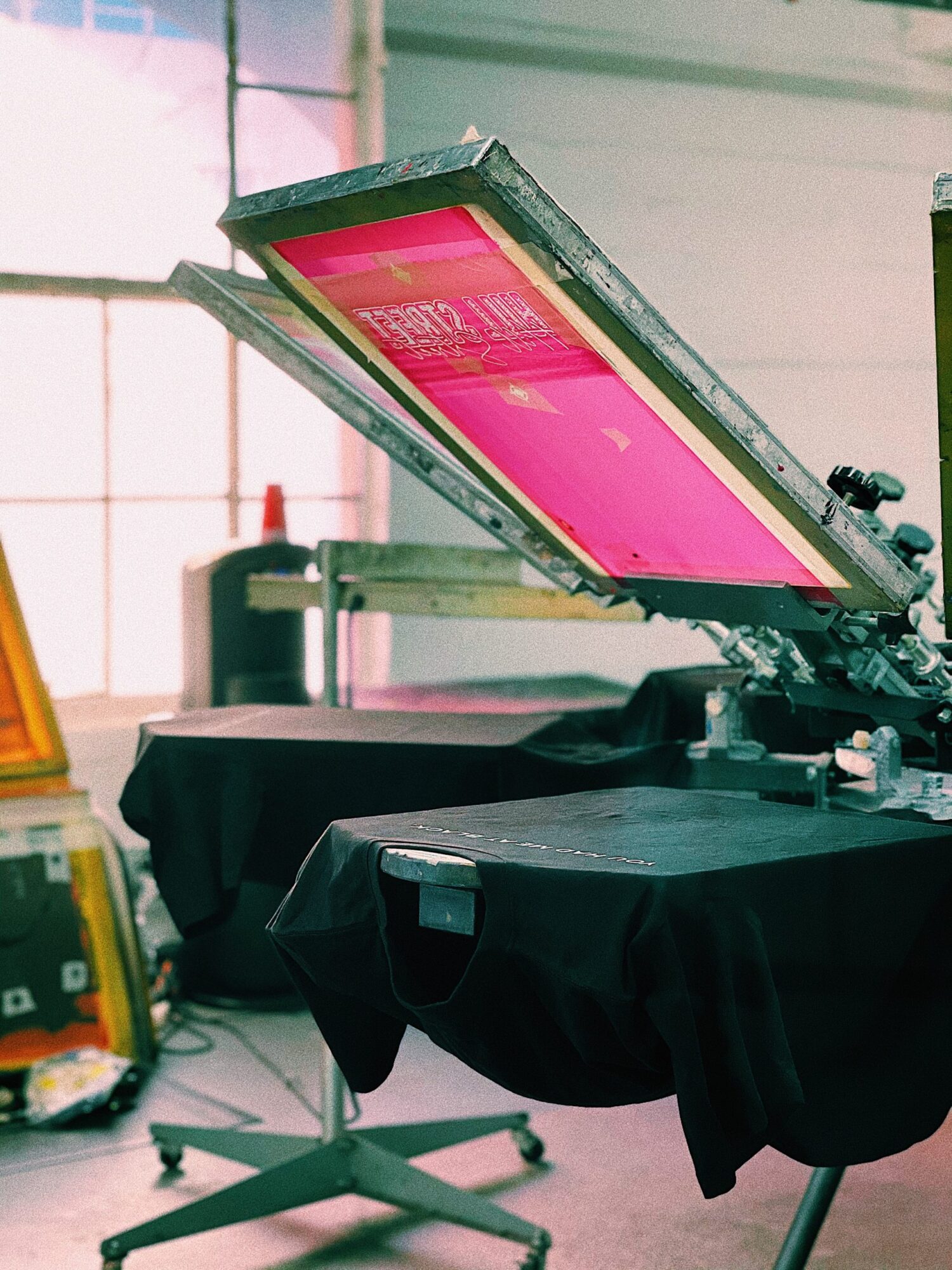
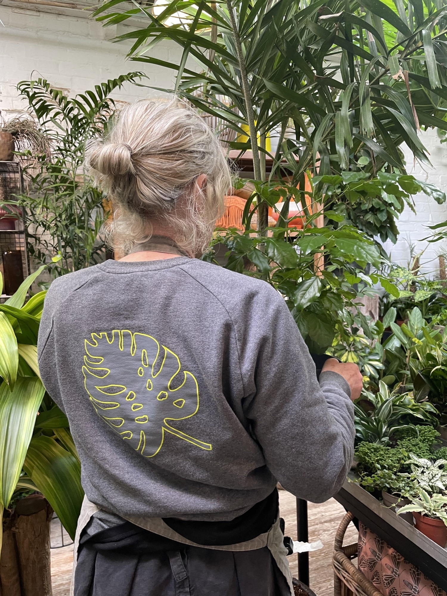
How To Save Money On Your Print Order
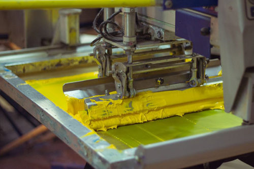
We understand you’re often working on a set budget so we always try to help figure out the most cost effective way to get your orders made.
While our prices do depend on many factors; such as, artwork, order size, garment quality, and deadline, we’ve put together a list of some tips to keep your costs down and save a bit of money on your order.