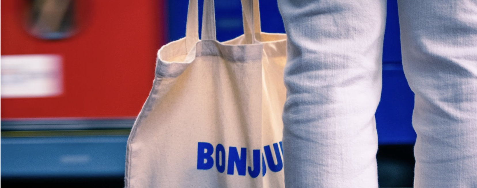
Undeniably recognised as the most popular personalised accessory, the Tote Bag is our best-selling accessory for events and promotional merchandise alike, with our Organic Cotton Shopper Tote quickly becoming a client favourite, and with good reason. Let’s break it down.
Reusability and Sustainability
Tote bags are reusable and can last for a long time, reducing the need for single-use plastic bags. This makes them an eco-friendly choice that aligns with the values of many consumers and is a great hack when wanting to do more implicit marketing launches, as clients are likely to re-use these in more organic settings that would be unreachable from a company without extension marketing budgets. By offering personalised tote bags as a core personalised merchandise offering, company’s can showcase their commitment to sustainability and attract customers who prioritise eco-friendliness – a growing trend between Gen Z’s and Millennial shoppers; with 90% more willing to make a purchase that is more sustainable.
Practicality and Versatility
Tote bags are an everyday practical and versatile essential, making them suitable for a wide range of purposes. They can be used as grocery bags, beach bags, gym bags, or even as a stylish accessory for everyday use. Personalised tote bags can also be used as promotional items at events, conferences, or trade shows, showcasing your brand and increasing visibility.
Cost-Effective and Customizable
Tote bags are one of our most cost efficient merchandise options and at ICON, can be customised to reflect your brand’s identity and message in so many unique ways. Our Long Handle Shopper Tote is amongst the most popular styles we offer; averaging to just under £1.50 per unit, and can be designed with your company logo, slogan, or artwork, making them an ideal personalised merchandise option. Our Tote bags also come in a variety of sizes, colours, and styles, allowing you to choose the best option that suits your brand and target audience.
Trendy and Fashionable
Tote bags have become a trendy statement piece and fashionable accessory, with many designers and brands incorporating them into their collections. Personalised tote bags can be designed to reflect current fashion trends or to showcase your brand’s unique style and aesthetic, with Tote Bag sales reflecting an upwards growth trend regardless of niche or industry. By offering this in-trend form of personalised merchandise, companies are able to appeal to a wider audience; especially those who prioritise eco-friendliness, and increase overarching brand awareness.
With their reusability, versatility, cost-effectiveness, and customisability, Tote Bags offer an edge over choosing your brand’s next merchandise offering, creating an opportunity to showcase your brand’s values and increase visibility. So, why not make tote bags your company’s next personalised merchandise choice?
Keen to find out more? Our passionate team of experts is waiting to hear from you and help you guide your next order, Email us at sales@iconprinting.com or click here for an instant quote!
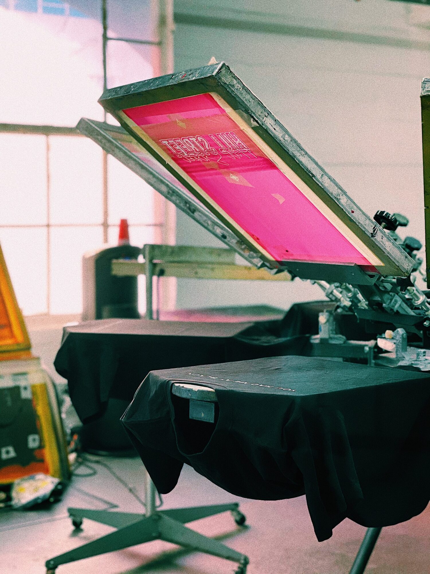
Did you know that Screen Printing is amongst the most popular and versatile customisation techniques available? Pride for its extensive array of coloured inks, affordability and quick turnaround times, it’s our go-to at ICON for all orders in large quantities and one-off pieces alike. So how has this effective transfer technique that creates bold garments evolved overtime? Let’s break it down.
What is it?
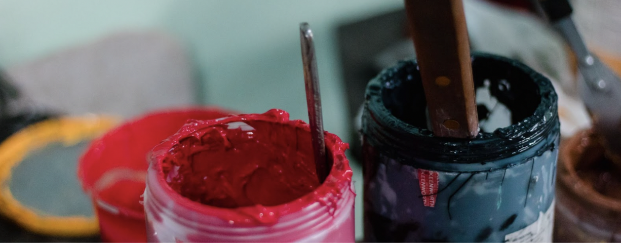
Screen printing is a printing technique that involves the use of ink and a mesh stencil to transfer an image or design onto a material: canvases, posters and most commonly; and our personal favourites – garments! With a large selection of inks available no matter your requirements: sustainability, base garment choice and affordability – the inks used during the printing process are truly what differentiates this best-selling printing service.
The most popular of these types of inks include: Plastisol inks; for ease of use and durability, Water-based inks; for an eco-friendly alternative, and Discharge inks; ideally suited for high quality prints on darker fabrics. If you’re looking for new custom-made merchandise, reach out to us by clicking here, and a member of our sales team will direct you towards what service + inks are right for you.
The History:
The evolution of printing inks is a story that spans thousands of years, from the first use of ink made from plant and animal materials to the development of modern synthetic inks that we use today. One of the earliest applications of screen printing inks was made using a mixture of water, gum arabic; a natural gum originally consisting of the hardened sap of two species of the Acacia tree, and soot, a slightly sticky, fine black or brown powder. This ink was applied to a stencil made of silk, which was stretched across a frame and pressed through; inspiring the screen printing techniques we use today.
Types of inks:
The early 20th century brought over the development of synthetic inks, created by mixing pigments with synthetic polymers, which allowed for a broader range of colour options and improved durability. Synthetic inks were also easier to work with than the traditional inks and had better adhesion properties, which made them ideal for printing on a wide range of materials, including fabrics, plastics and metals.
With the rise of technological advancements in the 60s, Plastisol ink was invented. Plastisol is a type of ink made from PVC particles suspended in a liquid plasticizer, or more simply put: a type of ink containing microplastics mixed with a liquid that helps it stick to things. Not only is this type of ink known for its adaptability and permanence but it is also ideal for printing on both light and dark-coloured fabrics. Our clients love the speediness of using this service specifically for their event merchandise – Check out our reviews.
The sustainability movement drove an upsurge on finding more eco-conscious substitutes for existing printing inks and introduced Water-based inks. Popularised as a green alternative to traditional plastisol inks, water-based inks are known for their non-toxic, low-odour, and low waste production benefits. Made up of water and a colour pigment, although available in a limited range, Water-based inks are popular for their ability to produce bright and vibrant, long-lasting colours and often best suited for printing on cotton, linen, and other natural fabrics.
Similarly, in the late 1990’s, another type of eco-friendly water-based printing ink; Discharge ink, took the printing world by storm, revolutionising the screen printing process. Designed specifically to be used on dark-coloured fabrics, these inks are formulated by bleaching out dye from a chosen fabric, creating a lighter colour that can then be printed over with a brighter, more vibrant ink colour, producing crisp results that feel much softer than plastisol printing.
Whether you’re looking for a durable and versatile ink for printing on fabrics or a specialty ink for creating unique designs, there is an ink out there that will meet your needs.
Keen to find out more? Our passionate team of experts is waiting to hear from you and help you guide your next order, Email us at sales@iconprinting.com or check our catalog and get an instant quote!
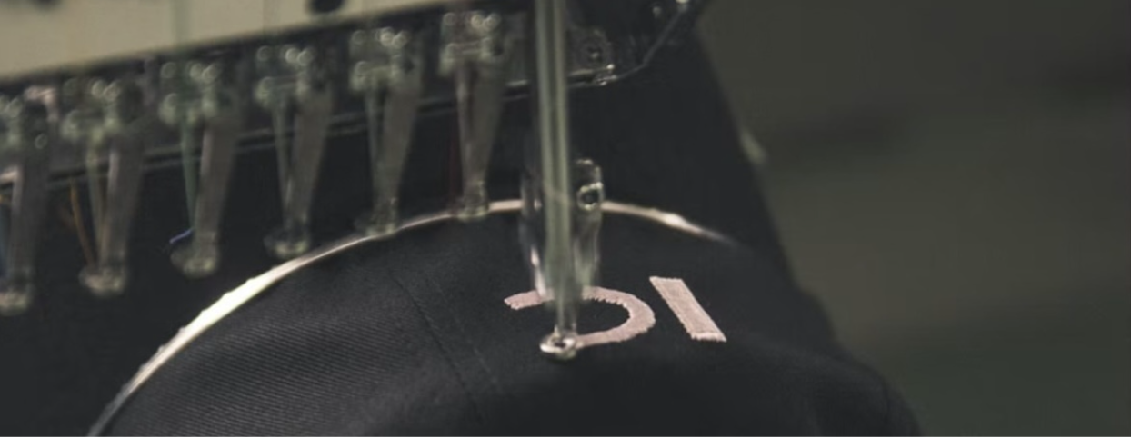
Are you looking for an effective way to grow your business outreach? Whether you’re an aspiring entrepreneur, small business owner or content creator looking to gain more traction and solidify brand loyalty within your community, embroidered personalised apparel is an excellent option. Embroidery stands as one of the oldest, and most traditional forms of customising fabrics – dating back to the Ancient Egyptian era where intricate embroidery was stitched into linen as a symbol of status, and is one of our personal favourite services we offer here at ICON.
If you own a brand or business (or are hoping to establish one!) you know how important it is to build an image your audience can recognize, and trust. Here’s how embroidery can make that happen:
Premium Feel
Amongst the most versatile styles, Polo Shirts are a fan favourite when it comes to premium feel merchandise, and is perfectly customisable with your unique company logo and branding with embroidery. Not only does the dense texture of the garment contribute to feeling more high quality, but accompanied by bespoke embroidery in 100% cotton thread, further adds that sparkle of luxury to your pieces and your customer’s perceptions.
Long Lasting
For our clients who need bespoke personalised merchandise intended for use in an industrial setting or for work wear, our embroidery services are the most suitable form of personalisation!
Embroidery is durable – executed with only the highest quality cotton threads, versatile – available in a vast array of colour and finish options and lastly, offers long lasting wear and tear, acting as the ultimate addition or alternate to screen print.
A Unique Way to Stand Out
Embroidery with us allows you to customise all your apparel, from our signature t-shirts and totes, to our new range of baseball caps, all with unique designs that feature your logo or chosen design. Not only does this create a more premium and professional finish, but this finishing touch also gives your existing and potential customers something tangible to remember you by. In a world where everyone is trying to get their message across, having something physical such as our Heavy-Blend, Unisex Organic Hoodie, the ultimate blank canvas for embroidery, can be a great way to stand out from the crowd. Our clients love the high-quality finish and praise the wearability of their embroidered designs, with Melendez loving their “top quality embroidery results.”
Design is a tricky thing. It’s subjective, can be difficult to define, and it’s often used as an excuse for something that’s not quite right or good enough. But what does good design look like? Here at ICON, we work with our clients and tailor the experience based on your needs: from design, choosing the most appropriate base garment and printing techniques, right down to the final product. Here’s our list of top tips breaking down the basic elements of good design and how your business can engage with these for your next custom-made merchandise orders.
Good design is innovative.
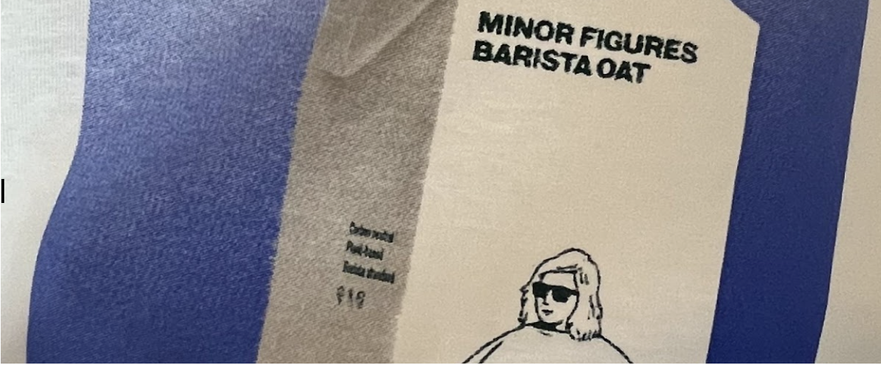
Innovative design is the best design, because it’s most relevant to the customer and their needs. When defining design in terms of proprietary artwork and company branding, continuous innovation within your decision of typography, juxtaposition of colours, graphic choice and placements is a key way to differentiate from the crowd. Our clients at Minor Figures did just that, with their unique use of elegant typography and targeted use of playful yet minimal graphics which address their target customer’s needs, have created a design that is one of the most effective within their operating industry.
Aesthetic plays a large role in design
Design is a way of communicating. It’s how we share things with each other and how we express ourselves, our ideas and feelings. Without design, us humans would find things mundane and utilitarian, and effectively remove the joy of effectively connecting with a brand/business. To make complete use of your design, consider implementing traditional design principles such as utilising white spaces, playing with proportions and creating patterns. Top tip: patterns are a great way of giving your design that extra bit of oomph and are extremely pleasing on the eyes, for more, why not check out: The Power of Colour.
On T-shirts, utilising aesthetic company designs and artwork further encourages your customers to wear your personalised merchandise often and in settings your brand may not be able to organically reach, building an even stronger force of brand awareness your way.
Quietness is a sign of quality
It’s quiet when you don’t have to shout to be heard and it’s quiet when there are no extraneous sounds coming from your design, whether they’re in the form of too many colours, mismatched fonts or other distractions. Minimal design is a classic style of design that is characterised by simplicity, clean lines, and a monochromatic palette of colour enhanced with accents, and one that will live on beyond its time. Famously seen with luxury brands like Hermes, the sleek choice of typography and intricacy in line design make it easy to associate with and timeless in nature. Similarly, consider using symbols where possible to keep your designs clean and feeling minimal, and for the ultimate accompanying fonts, read our infamous article on: The most Successful Typefaces, backed by Science.
Good design is as little design as possible
It doesn’t need to be complicated, just do the job well. In a world where we are bombarded by design sub-genres, styles and trends, it can be hard to differentiate what makes one good design different from another. While there may be no easy answer (it depends on who you ask), there is one thing all good design has in common: it’s as little design as possible. It’s about being honest and authentic— and designing something that’s still beautiful and meaningful but still fitting the formality of the nature of your customer, product, service or industry offering.
So the takeaway is, good design is good design. But not just any old good design—it has to be innovative and make sense in context, whilst making use of our favourite design elements. In other words, it’s not just a matter of making what looks good, but what makes you feel good.
Keen on finding out how we can take your dream merchandise designs and make them a reality? Get in touch with a member of our sales team at sales@iconprinting.com or click here for an Instant Quote!
Priding ourselves as experts in the field, here at ICON we cover all your printing needs from A to Z. Whilst screen printing is our most loved service, and unsurprisingly, is amongst the most popular fabric printing methods in the world, it is also widely scrutinised under the sustainability radar.
Why? Let’s break it down.
The History:
Requiring practitioners to use a brush to manually force ink through the screens, the origins of screen printing date back as early as the 1920s. With the invention of Vasilantone’s dual rotary printing press; which allowed for fabric to be placed through sets of rotating pallets and print heads, the traditional transfer method was made obsolete and altered the history of this holy-grail printing technique. Initially, limited to hand-made only, screen printing was slow and costly. However, after Vasilantone’s invention, printing happened much more quickly, cleanly and efficiently, becoming a designer favourite.
With the use of screen printing now directed towards the production of mass produced personalised merchandise, due to the cost and time efficiency, its use is deemed unsustainable. However, with now being able to control the production for the same cost efficiencies, screen printing may be made more sustainable through limiting the overproduction of unsold merchandise. Yet, not all of it boils down to scale, but more so – resources.
Screen printing makes use of ink to print. Plastisol inks contain PVC; a micro-plastic named the most environmentally damaging of all plastics. Not only does this cause serious health risks throughout the production process but also contributes to the plastics damaging ecosystems on our planet.
Water-based inks on the other hand: pigments suspended in water, provide us with a more sustainable alternative. This no plastics option is as sustainable as can be from production to product, better for your skin; due to the fabric being left more breathable and the screens and equipment, after printed, are washed with plain water. At ICON, we aim to be as eco-conscious as possible and drive the change towards more sustainable printing by leading by example. As our raison d’etre, we take into consideration your order quantity, use and designs when deciding how we complete your order, and target to be the most planet friendly as possible.
When considering your medium for personalised merchandise, t-shirts are the first form of apparel that comes to mind – and we have to agree! Despite it being the most popular type, screen printing can be done on a variety of custom-made apparel such as baseball caps, reusable bottles and more. As part of our printing services at ICON now extended to include these options, we also advise on giving new, and more sustainable apparel, a go.
In comparison to a personalised, water ink dyed, screen printed sweatshirt, custom printed baseball caps are more durable due to the lack of washing involved, and as a result, last longer. Similarly, take into account when deciding on creating merchandise: are you able to set-up a pre order so the printing quantity can be optimised to only those items sold? Can you consider printing on sustainably sourced, organic fabrics? A lot of our sustainability concerns may also be addressed along the journey of your order.
To find out more about sustainable screen printing for your personalised merchandise,contact our sales team or click here to get an instant quote.
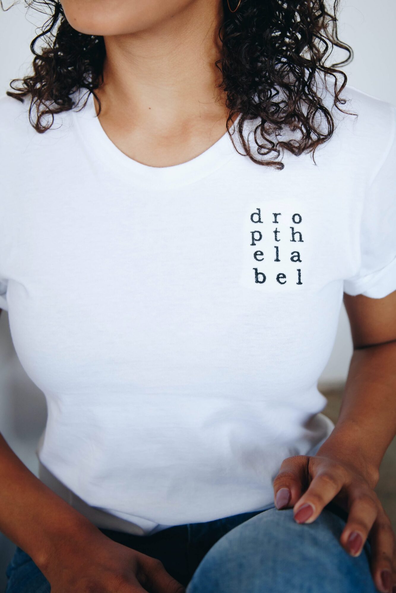
Working within the realms of customised printing, ICON has successful delivered personalised merchandise to thousands of clients in the UK and worldwide in our time within the industry. As part of our expertise, we provide white labelling, and more particularly, re-labelling services, which can readily be used to improve quality, enhance brand image and make significant impact in increasing the perceived value of merchandise.
Here’s everything you need to know about it.
What is white labelling?
White labelling is the process of ordering already assembled products from a manufacturer or wholesaler and then customising these products to include your own labels, branding and unique offering. Here at ICON, we work closely with clients who want to commission this service and provide the product i.e., our Organic Unisex T-shirts, our Heavy Blend Hoodies and other printable apparel we sustainably source, and customise these with their chosen colours, designs and even customised company or logo-specific labelling.
For our current clients and prospect users alike, the method of white labeling has now made it exponentially simpler; and more cost effective, to create their own personalized merchandise. An industry in particular that has been momentously impacted by the widespread growth of white labeling is the Music industry.
Professionals in the industry such as Cochrane (2022) reported a significant rise in the demand, and the corresponding sales of fan merchandise, with Travis Scott’s London O2 show in August of this year, selling nearly £1 million pounds worth of merchandise at these concerts. For smaller or independent artists in the UK within the industry, a study conducted by Spotify (2022) found an identical sentiment, with revenue generated from fan merchandise providing a sustainable financial stream of income for these artists during a time where revenue from streaming is negligible and the cost-of-living crisis is continually impacting ticket sales.
Why to do white labelling?
With ICON’s white labelling services being simple, sustainable and cost effective to execute, it’s now easier than ever before to start your business, improve your brand awareness and grow a stronger audience. Whether you’re an independent creator or hosting a local triathlon, making use of our white labelling services enables a stress-free journey to design and sustainably executing your ultimate personalised merchandise.
How to do white labelling?
It’s cost effective:
By using a white labelling printing provider, the costs of sourcing a supplier, having to order in large or minimum order quantities, and the price of working with multiple vendors; such aa a graphic designer, a wholesaler and an embroidery specialist, are removed. Here at ICON, we streamline the process of creating your personalised merchandise and manage every stage of the process, all in-house and all within our quoted price.(there’s no surprises!)
It’s simple:
The complexity of creating personalised merchandise, especially with the plethora of textiles, printing techniques and more, can be hard to understand and fulfil. White labelling allows for a large majority of the hard work; and time, associated with production to decrease – or be removed all together. Now, without the need to sample fabrics, find a manufacturer and manage a production team, your time can be used towards building your business or working on making viral content for your audience.
It’s more sustainable:
Without the associated energy and waste used to mass produce merchandise with minimum order quantities for more competitive prices, you can now produce only what you need or what has already been sold. By placing sustainability and environmental impact at the forefront, here at ICON you can purchase quantities as low as a single item, and choose your desired fabric, apparel type and according to your design, a printing technique as well.
Want to find out more? To get an instant quote, click here or contact us at sales@iconprinting.com and one of our team will be in touch to get you started.
The history of the t-shirt can be traced back to the early 20th century, and was a method of unifying those serving in the US Navy. By having the same undershirts whilst at sea; in addition to their uniforms, not only was there a community and union ship formed, but the similarity in garments introduced a layer of implicit equality between peers, boosting a higher happiness level.
Shared community brought about increased morale as a result, and to no surprise, further brought a rise in productivity. This minor yet radical change has influenced the new generation of workplace attire and encouraged now employers to have set workplace uniforms or elements of personalised merchandise as part of their code of conduct, and has positively left these businesses experiencing a 12% higher productivity level of their happier workers.How? Here’s the science behind it.
The psychology:
According to Fashion Designer Sikhounmuong, the experience of personalisation; monogramming in particular, “is one tradition that’s both personal and universal at the same time,” and is a key example that is used in customising personalised t-shirts/uniforms. This is because, when studying the impact of community on workplace morale, it was found that in environments where employees share a uniform or a similar look, they are likely to experience an increase in morale as employees feel connected to a common goal, and belong as part of a team.
In addition, more than 75% of woman-identifying employees in the work force highlighted that they suffer from feeling uncomfortable, and largely anxious, in the workplace; as stated by Forbes-Bell, industry specialist in fashion and human psychology, and how a unified company clothing policy can make all the difference in reducing this problem.
Similarly, traditional formal “office wear” such as blazer pant-suits have been found to load cognitive thinking and encourage a hierarchical, authoritarian environment – both of which are elements disrupting positive workplace morale. Whereas, in their studies in the relationships between clothing and examination performance; Bell, Cardello & Schutz (2005) found that comfortable garments, those which are more informal in nature and made of more natural fabrics; such as our trustworthy Organic Cotton Unisex T-shirts, are likely to boost cognitive performance, productivity and happiness levels.
Our client’s at N1 Garden Centre would agree, and came to ICON with the request to create custom-made, nature inspired, workplace attire. When asked about the importance of their personalised workplace t-shirts, Caroline Humphreys, the Office Manager said: “Our uniforms from Icon Printing fit our branding perfectly. They are stylish but most importantly practical. We have gone for lots of different types of items so that staff working outside can layer up and keep warm.” With respects to recognising the change to cooler weather, the N1 Garden centre took this initiative, resulting in happier – and warmer, employees.
Why you should execute this now:
Whether you’re a large corporation engaging thousands of employees, a more boutique home-based business or a freelance content creator with a team, personalised apparel may be the magic in further levelling-up your collective team morale. Through association, fostering community and leveraging a more creativity-first approach to work, the next generation of workplace attire is formulated of comfortable, casual and [insert] pieces to make the most integral part of any business; your employees feel happier. At ICON, we believe there is no better way to foster a positive community, and work tirelessly in the business of happy clients in creating their bespoke personalised t-shirts and outerwear.
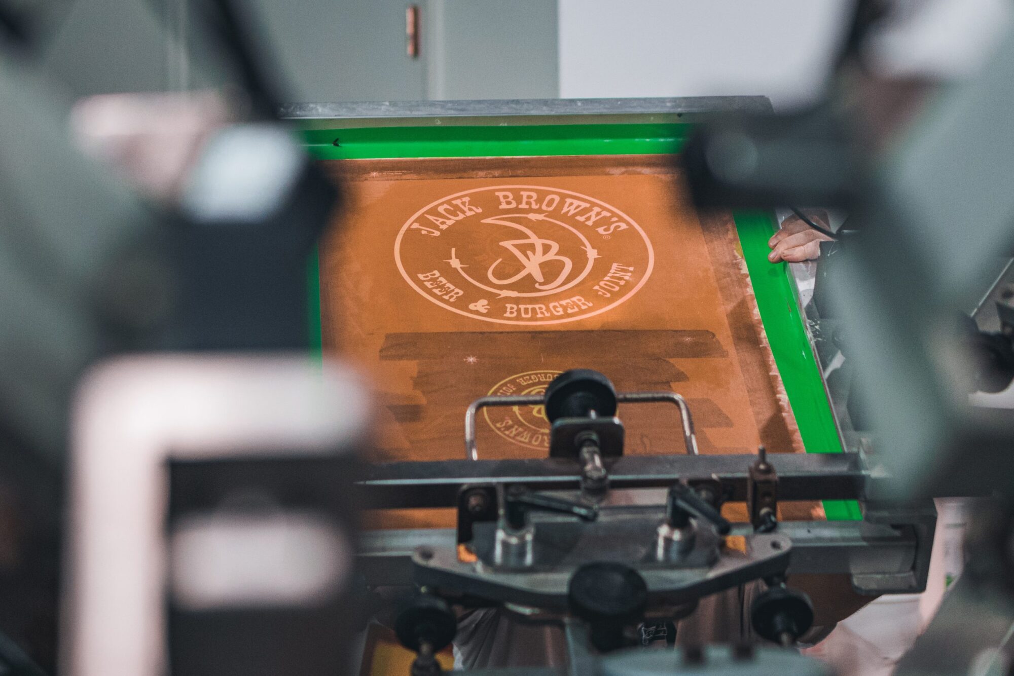
In the print world, screen printing is one of the most common methods used in personalised merchandise production, and with good reason. At ICON, it’s often our main method of printing for time sensitive, high-quality and long-lasting personalised t-shirts, whilst allowing for expert levels of detail and a wide variety of customisation. However, this holy grail method of printing has been labelled unsustainable in the past and is largely a result of the dyes involved in the process. Let’s break it down.
The concept:
Screen printing comprises of using the technique of creating a picture or pattern by forcing ink or metal on to a surface through a screen of fine material. The cost of using this printing technique is based off the artwork involved; the level of details, the range of colour, as each colour requires a separate screen, adding to the additional cost, and the volume of the order. Each of these factors combined then impacts the type of ink and dyeing process that can be used.
What inks are used to fulfil an order is ultimately based on the suitability of the dye for the merchandise order requested. Screen printing works ideally for larger orders that encompass artwork with spot colours, as opposed to photographs or full colour prints with gradients, and are most commonly made using plastisol ink. Although widely applied when screen printing and renown for it’s durability and cost-effective nature, the main component in plastisol ink is made with PVC and is essentially liquid plastic, making it difficult to recycle, break-down after the product lifecycle, and overall is harmful to the environment.
Water-based inks use water as the main solvent in carrying pigment, which allows for the inks to be sharp and vibrant, making it much easier to extract, produce and better for the environment. With water-based screen printing, the inks used are thinner and more transparent than other types of printing dyes and, in comparison to plastisol ink, water-based dyes penetrate deeper into fabric, resulting a softer and more breathable print, not crumbling when the t-shirts are scrunched up. According to Bristow (2021) making use of water-based inks and organic cotton for your apparel allow for deeper absorption into the fabric, increasing wearability and product longevity, driving further within the eco-friendly nature of the dye.
While water-based inks are the more sustainable screen-printing option, it has its limitations.
Cottons only: The problem with water-based screen printing is that you cannot print on 100% polyester. This is because when water hits polyester, it creates a film on top of the fabric that keeps the ink from seeping in. Instead, here at ICON, we use 100% organically sourced cotton for your garments. For more options, check out our wide selection of apparel.
Know your dyes: There are all sorts of water-based inks, from high solids water-based inks, which are excellent for stretchy fabrics, to discharge inks, which works through a bleaching process where the colour of the ink replaces the shirt’s colour. Look for dyes that are made from natural, sustainable materials and these dyes work just as effectively as synthetic dyes, but are much better for our planet.
At ICON, we pride ourselves as pioneers in sustainable screen-printing industry. Want to find out more? Click -> to get an instant quote or email us at sales@iconprinting.comand someone from our team will get in touch.
If you find yourself struggling with your business outreach, tirelessly strolling through Canva for the ultimate job-landing resumé template or simply want to keep up with what’s trending in design, this one’s for you.
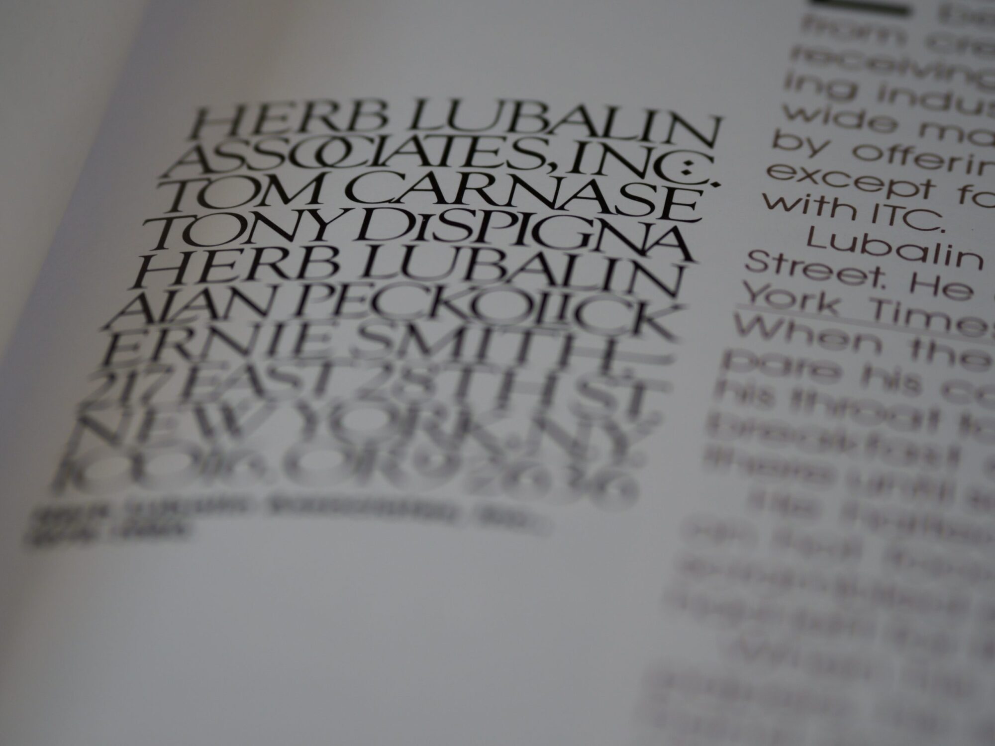
After our exploration on the power of colour, typography is equally, if not more important to your brand and business identity; influencing the way we feel, how we perceive the brand andthe“personality” we associate it with. This explains why when we view serif typefaces, it tends to feel more traditional; with a formal tone, and is used in a business’ branding to say “I’m trustworthy and reliable.” In contrast, sans-serif typefaces tend to project a more easy-going aura with a friendlier tone, announcing “it’s all fun and games over here!”
Choosing the right typeface is one of the most important decisions in branding and web design, influencing your audience long before they read a single word.
Let’s start with the basics.
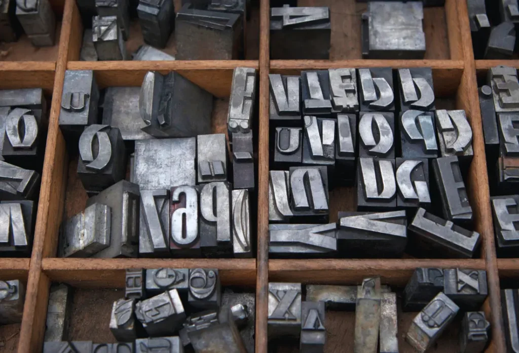
Though often used interchangeably, “font” and “typeface” do not mean the same thing and can have a lasting impact based on the one(s) you choose. A typeface refers to a type design; or the manner in which lettering is composed, and includes all variations of that design. For example, the popularly seen Helvetica is a famous typeface and a favourite amongst luxury fashion houses. Fonts, however, refer to the variations possible with a typeface. For example, Helvetica Bold, Helvetica Thin or Helvetica 10 pt, referring to the text size, are three different fonts.
Generally, typefaces are characterised into two groups – serif or sans-serif. Serif typefaces are demonstrated with the delicate and strict strokes at the end of the letters, i.e.Times New Roman. Whereas sans-serif typefaces, as the name implies:“sans” meaning“a general absence,” are fonts without serifs, such as Arial.
Why it’s important to get it right.
In a study conducted on the readability of typefaces published by Dogusoy, Cicek and Cagiltay, found that overall sans-serif typefaces had improved legibility, aka readability by participants and were therefore easier to understand. However, within the same study, experts discovered that serif typefaces had higher retention rates; participants tended to focus on these for a longer period of time and when questioned, had improved memory about the text they were proof-reading. Conversely, a paper published in The Design Journal took it a step further and studied type outside the traditional use of serif and sans-serif, discovering the positivecognitive effects of using disfluent typography, finding that harder to read typefaces can improve learning conditions. Interesting, no?
Here’s a compiled list of our favourite most successfully used typefaces and type family
Start byreflecting into your own brand or business’ typeface and see if it’s in-line with your aspiring brand identity and message. Here at ICON, we use a sans-serif typeface of choice that accurately represents our brand’s identity; youthful, friendly and inclusive, with a hint of formality.
These examples each represent a different approach to style, readability and brand personality.
Futura
If it’s good enough to be on a plaque on the moon, it’s good enough for us. Invented by German author and designer Paul Renner in 1927, the sans-serif Futura typeface quickly grew to be the most influential typeface of the 20th century. The retro-futuristic type has been used across industries, most notably film and media, and is the go-to typeface for advertising.
Baskerville
Designed by John Baskerville in the 1750s, the Baskerville serif typeface exudes elegance with a hint of mystery. Rightly so, as according to user interface expert Bishop, this typeface is “excellent for book design — and it is considered to be a true representation of eighteenth-century rationalism and neoclassicism.”
Helvetica
Created in 1957 by designers Mac Meidinger and Eduard Hoffman, this sans-serif typeface is the most widely used typeface across industries, and with good reason. Helvetica’s versatility and minimalism make it the ultimate typeface for easy to read documents, customised branding and merchandise, and in the opinion of Yang; CEO of the world’s leading resume company, a typeface that will make your job application stand out.
These additional typefaces are backed by research, used widely in graphic design, and offer strong functional benefits across digital projects and printed materials. They also allow designers to explore different types of typefaces, from old style classics to monospaced typefaces.
Georgia
Georgia remains one of the most widely trusted serif typefaces for digital reading. Its refined letterforms and high contrast make it ideal for long-form content. Designed with the history of traditional book typography in mind, it bridges the gap between classic print styles and modern screen rendering.
Roboto
Roboto is a geometric sans serif typeface built for digital interfaces. Its open curves and even spacing make it extremely legible across devices. The font family includes several weights, giving designers flexibility without switching to another typeface. Roboto’s structure also supports a large range of symbols, which is essential for UI and UX work.
Garamond
One of the oldest and most respected serif typefaces, Garamond remains a favourite in book publishing. Its organic letterforms and efficient use of space give it a warm, human aesthetic.
Inter
Inter is one of the most effective typefaces for digital projects. Designed with screen legibility as the priority, it offers an extensive alphabet, a rich character set and careful spacing that enhances usability. Its flexibility makes it a go-to choice when designers want a single typeface that performs consistently across headings, UI elements and paragraph text.
Courier and monospaced typefaces
Typewriter fonts such as Courier and other monospaced typefaces align all the letters to equal width. They are indispensable for coding environments or design projects that need a utilitarian, structured feel.
These examples demonstrate how allowing designers to explore different font types can open up new creative possibilities.
Sans serif typefaces
Sans serif typefaces continue to dominate modern branding because of their clarity and adaptability. In most cases, a sans serif provides stronger readability in digital contexts, especially when designers only need one font for both body copy and headings. Many sans serif styles now come in advanced OpenType formats with extended symbols and multilingual alphabet support, making them suitable for global brands.
Ready to create your own standout design?
If you’re planning personalised merchandise but aren’t sure where to begin, ICON Printing can help you move from idea to product in less than 14 days. Our team can advise on everything from typeface selection to artwork approval, ensuring your brand’s identity stays polished and cohesive. Get a quote!
Frequently asked questions about typefaces and web design
What is a typeface?
A typeface is the overall design of the letters, including all variations such as bold, italic or condensed.
Is a font the same as a typeface?
No. A font refers to a specific weight or size within a typeface family.
What is an example of a typeface?
Helvetica, Futura and Baskerville are well-known examples.
What is a synonym for typeface?
“Font family” or “lettering style” is sometimes used, though not perfectly interchangeable.
What are the five basic typefaces?
Serif, sans serif, slab serif, script and monospaced typefaces.
What is the difference between Arial and Helvetica?
Arial is a digital typeface inspired by Helvetica, but with subtle differences in stroke endings and spacing.
Why is Futura so popular?
Its geometric shapes, clean curves and timeless modernism make it versatile across industries.
What is a typeface family?
A group of related fonts, for example, Helvetica Regular, Helvetica Bold and Helvetica Italic all belong to one type family.
Get in touch with us!
If you’re looking to increase your reach through personalised merchandise and don’t know where to begin with design, contact us by clicking the link and our team of experts will help take you from idea to product in less than 14 days!
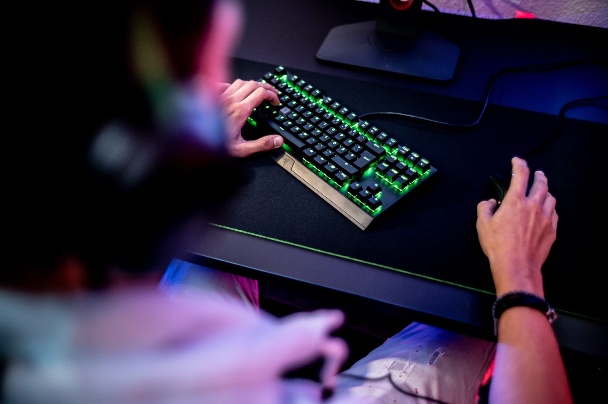
If you’re an influencer in the Gaming space struggling to widen your reach and strengthen your fan base, this one’s for you.
Today, 2.8 Billion people make up one of the largest communities in the world — Gamers. With one in three people worldwide engaging in playing video games on a weekly basis; a number continuously growing as you’re reading this, the gaming industry has experienced a boom like no other, with a projected market value of $300 Billion by 2025. This surge of players online has created a new opportunity for gaming enthusiasts; to quit their day jobs and generate full-time incomes as Gaming Influencers; Streamers, Pro-level gamers, E-sport players and more.
With a cult following built on platforms like Twitch, Discord and Youtube Gaming, Influencers in the industry have marked their territories online by accumulating an impressive fanbase. Gamer turned Youtuber PewDiePie is the most subscribed to person on Youtube till date, with a monumental 111 million watchers. What keeps the gamer audience growing? According to a study published in the International Journal of Interdisciplinary Research: fan-themed custom apparel.
Personalised merchandise has been named the holy grail community engagement tool across the entertainment industry. In a growing yet saturated space for upcoming Gaming Talent, the ultimate method to differentiate a brand and nourish an online audience is through the launch of high quality, limited quantity individualised gear.
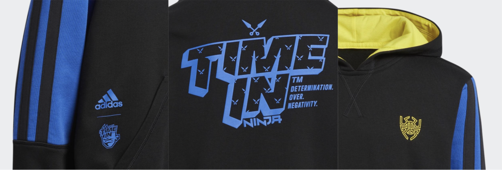
Ex-pro-level player now Twitch sensation; Tyler “Ninja” Blevins, was amongst the first gamers to launch a collaborative collection for his impressive 13 million Twitch streamers with Adidas, selling out within minutes. Back by popular demand, Ninja’s second personalised merchandise collection with Adidas Originals launching in October of this year: Chase the Spark, has already gained significant popularity amongst his fans and is projected to sell out even faster. Similarly, E-sports expert Juggernaut, whose team worked with Gucci on the release of a limited edition watch; priced at $1,620, sold out entirely and is amongst one of the most sought after pieces for E-sport aficionados.
Image Credit: Adidas. In Image, The infamous Adidas Donovan Mitchell x Ninja Hoodie
The performance of these collections is nothing short of magic, and is reinforced by the fascinating concept of simplified consumer psychology. With it’s foundations in signalling theory, a notion developed by Economist Micheal Spence, members of an audience are likely to feel “more connected to a product, an organisation and one another through explicit association or signals” such as wearing merchandise belonging to a certain game, gaming community and influencer fan base.
This enclothed cognition; a term used to describe “the systematic influence that clothes have on the wearer’s psychological processes”studied by Hajo Adam and Adam D.Galinsky in the Journal of Experimental Social Psychology, found similar findings. Those who wore attire which is closely associated within the nature of a particular activity, such as wearing lab coats to perform tasks commonly associated with attentiveness and carefulness, found an increase in selective and sustained attention spans in their trial subjects. With gamers evolving to now break stereotypes of gamer attire and “what a gamer should look like,” fan-themed customised apparel bridges the gap between the creator and their online community like never before.
At ICON, we’ve worked with forward-thinking brands and creators alike, to create bespoke, sustainability driven, custom made apparel that lasts for the people we value the most: our community.
Keen to get your first collection of personalised merchandise underway? Get an instant quote here or contact our team for a more in-depth review into how we can take you from design to delivery in less than 14 days!
Tips and tricks, What's On
Boost your creativity with these 5 must-have apps for artists
Creative insecurity is the leading cause for artist burnout. Feeling uninspired, lost for motivation and overwhelmed with stimuli are increasingly common in any artist’s journey, and make the desire to create even more daunting. With the help of new digital tools on the market, we’ve taken the liberty to break down our 5 best-loved apps to guide your creativity when you’ve reached a stagnation in your inspiration.
Life happens, and without an outlet to release overthinking thoughts, anxieties and your daily to-do lists, the space to create can never flourish. Enter Mindly – a new organisation system that helps place all your thoughts and project ideas in one place, differentiated by association to keep “your inner universe” as mindful as possible. By building visual mind-maps and hierarchical structures of your entries, Mindly mimics the outline of your “solar system of thought” and is a great starter tool when identifying where those creativity gaps lie. An outstanding user interface and experience for both Apple and Android users, this app is a must have to help get organised and get your creative juices flowing.
The relationship between music and creative cognition is nothing short of astonishing. A 2020 study published in the Psychology of Music journal found that listening to music not only improves divergent thinking; the way the mind generates ideas beyond proscribed expectationsbut also increases the release of dopamine, a chemical which drives motivation to explore new territories, in turn boosting creativity. Brain.fm does just this – a research backed platform that customises music and background sound to enhance productivity and creativity with a key focus on guiding your brain to it’s desired mental state. Ideal for users on IOS and Google Play, with a variety of options to explore what works best for you.
Austin Kleon’s Steal like an Artistdissects the unspoken rules of being a creative, with the first rule encouraging those stuck in an inspiration block to revisit the works of their artistic heroes and engage in good theft – honouring, studying, crediting and transforming their ideas. Adobe’s very own Behance is a creative networking platform for visual artists; graphic designers, illustrators, fashion creatives, photographers etc., and allows for users to share their collections with like minded audiences. A place to meet artists and get inspired by the boiling pot of creative content, attract new opportunities, and finally, form a creative community of your own, Behance has it all. Available across platforms, impeccable UI and free for use across multiple disciplines.
Creative writing allows for your imagination to unlock new realms of creativity which may have previously been left unexplored, gate-keeping the potential to grow exciting ideas and hone new ones. Word Palette acts as the experimental creative writer’s guide to unleashing your creativity and eliminating writer’s block. It’s intelligently scrambled text acts as prompts to help guide your path through a written project, and presents you with a challenge that encourages outworldly creation. A fairly new addition to the creative digital app space, it has gained a cult following through it’s options to add your own inspirational articles/stories and integrate those into your writing. Unfortunately this app is only available for IOS users for the time being.
With masses of technology integrated into our everyday lives, taking the time to disconnect and engage in art therapy has proven to stimulate creativity, improve memory and encourage stress relief. Sketching without distraction can assist entering into aFlow State – a term popularised by positive psychologists Csikszentmihalyi and Nakamura, describing a state that “leads to a sense of ecstasy and clarity: [you] know exactly what you want to do from one moment to the other.” The holy-grail art studio on-the-go, Procreate is a phenomenal platform for this; to get immersed in a world of art and visual expression. A two time award-winning app for artists of all kinds; it’s wide range of tools, education access platform and creatives filled community provides the ultimate stepping stone to get lost in your creative flow. Available exclusively on the Apple App Store.
Tips and tricks
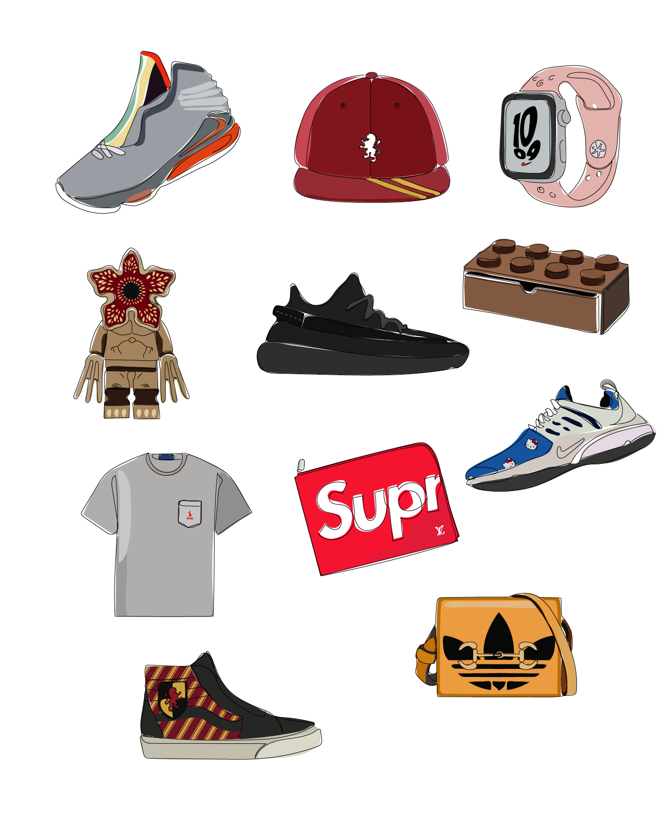
The most successful brand collaborations from the past decade
During the past decade, there has been no shortage of brand collaborations, and the buzz around some of the biggest partnerships has been huge. From celebrity-endorsed trainers to high street- fast food printed garment pairings, we’ve analysed the audience insights and media coverage to reveal the most hyped, surprising and tastiest collections from the past 10 years to reveal what it really takes to make a successful brand partnership.
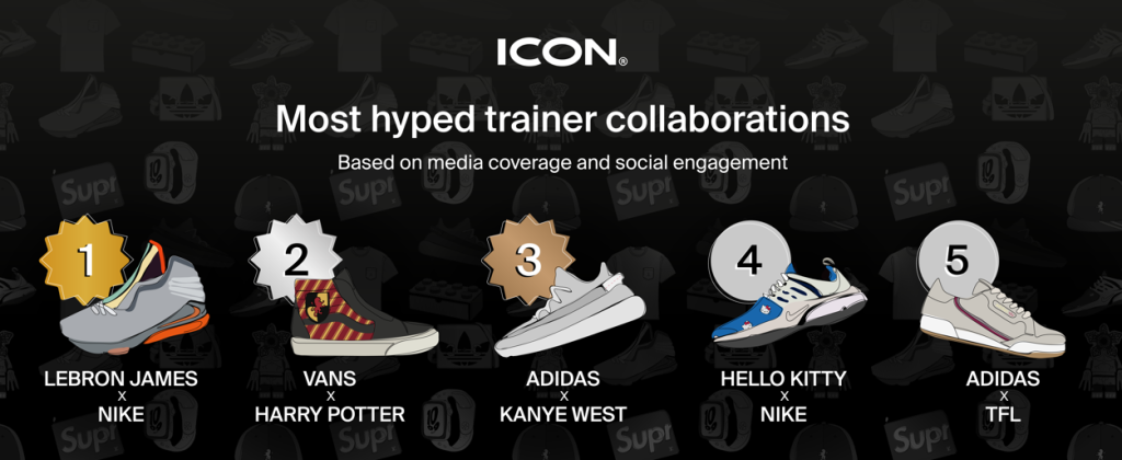
The most popular brand collaborations from the past decade
Image credit: ICON Printing
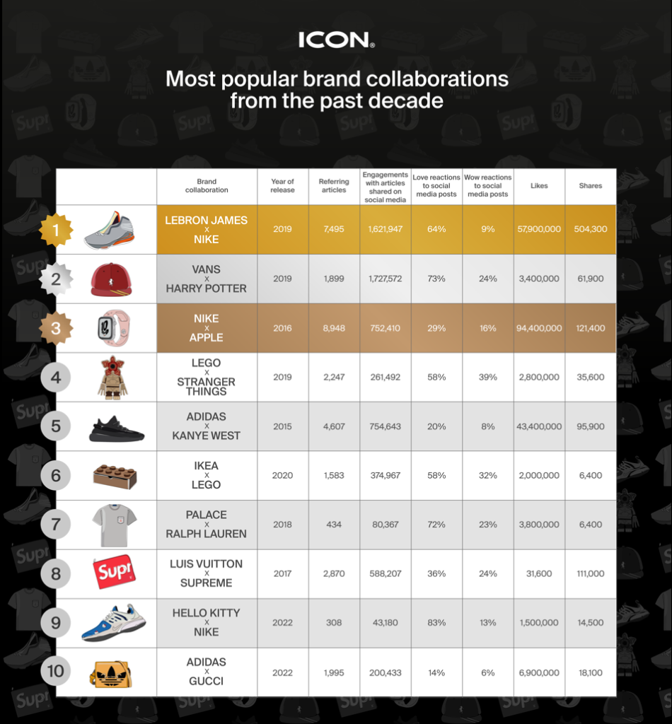
Using Buzzsumo to analyse articles written about each collaboration and Tagger to pull audience reactions on social media, we were able to rank the most talked about brand collaborations from the past decade to reveal the most popular.
Basketball superstar LeBron James has a long history of trainer collaborations with Nike however almost two decades into the partnership, the hype around his new releases doesn’t seem to be dying down. His 2019 edition drove 1,621,947 engagements with articles shared on social media, over 57,900,000 likes and a whopping 504,300 shares making the 2019 Nike X LeBron James brand collaboration the most hyped of the past decade.
But it isn’t just sports personalities that make for super successful brand partners. The 2019 Vans X Harry Potter collection came in 2nd position, raking in 1,727,572 engagements with articles shared on social media and 73% love reactions to social media posts. We can presume this was largely down to the movie franchise’s fanbase.
The first Nike X Apple watch was launched in 2016 to a rapturous reception from sports enthusiasts looking for a new way to track their activities. The collaboration between the sportswear company and tech giant generated 8948 referring articles and 9,400,000 likes on social media making them the 3rd most successful brand collaboration of the past decade.
Most hyped trainer collaborations
Over the past 10 years, sneakerheads have been vocal on social media, making their opinions known about new trainer collaborations. Unsurprisingly, the most popular brand partnership LeBron James X Nike came in first with their LeBron XVII. The release had fans divided on social which drove the highest social engagement and media coverage. The wizarding world went crazy for the Vans X Harry Potter printed trainer collaboration helping them claim 2nd place and Adidas X Kanye West’s Yeezy’s took the world by storm in 2015 placing them 3rd. Unexpected collaborations Nike X Hello Kitty and Adidas X Transport for London were also a hit based on social engagement and media coverage.
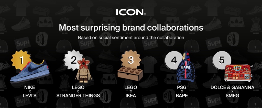
Most surprising brand collaborations
Analysing wow reactions on social media, we found the brand collaborations that were the most surprising- Nike X Levi’s secured the first position with their denim-clad, logo-printed trainers. Claiming 2nd and 3rd position were Lego collaborations. In 2nd came Lego’s partnership with the sci-fi series Stranger Things subsequently the toy brand’s more recent 2020 storage collection with IKEA wowed social media users. Claiming 4th and 5th position and taking fans by surprise was football club PSG’s streetwear with BAPE and luxury fashion brand Dolce & Gabanna’s colourful collab with SMEG.
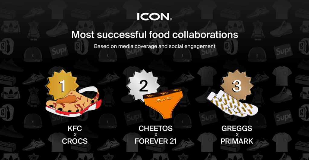
Most successful food collaborations
We all love a tasty treat and when it comes to brand collaborations from the past decade this was no different. KFC’s finger-lickin’ collab with Crocs was the most successful collection based on their media coverage and social engagement. In 2nd came Cheetos cheesy clothing range with Forever 21. High street retailer Primark’s recent clothing line with bakery chain Greggs was perfect for their target audience making it the 3rd most successful food brand collaboration.
With 12 years in the merchandise printing industry, Alex Econs shares his thoughts on what makes for a successful brand collaboration.
Understand your target audience
“Brand collaborations can be a brilliant way to target a new customer base however step too far outside the realms of audience relevancy and your brand collaboration will be a flop. Greggs X Primark is a great example of how brands have understood exactly where their audience shop and launched merchandise that was guaranteed to get fans talking. There is almost no limit to what companies from different industries can come together to create. ”
Novelty works
“Some of the most iconic brand collaborations have come from the most seemingly unlikely partnerships. Whilst it doesn’t work for every brand, novelty merchandise like the KFC X Crocs limited edition fried chicken shoes or Adidas X TFL trainers can be incredibly successful. Understand your audience and their lifestyle before choosing your brand partner and you’ll create a collection that fans will clamour over, consequently we often see these novelty items selling for a much higher resale price.”
Smash the marketing
“The most successful brand collaborations are hugely varied in their product offering and price point, however one constant amongst them is how successfully their teams promoted the merchandise ahead of the launch. Social media marketing in particular can engage fans attention right from the conception of the idea and the engagement we saw from the launch of these brand collaborations proves just why it should be a vital part of launching any merchandise.”
To find out how ICON Printing could print your next brand collaboration, see our services.
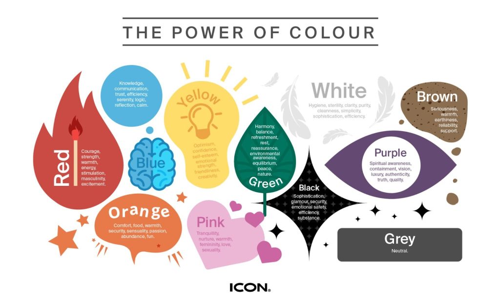
When it comes to choosing which colour to feature in your business’s logo, aesthetics are not the only factor to consider. Your business’s logo becomes part of your company’s identity therefore it’s important to make the right impression.
Research indicates that consumers make a subconscious judgment about a product within 90 seconds of viewing it and that up to 90% of that assessment is based on colour alone.¹ That’s the power of colour.
The way we perceive colour is never entirely objective, the use of colour in culture means we are guaranteed to make conscious associations with different colours and we will always make personal colour associations depending on our individual experiences. However, there are subconscious ways that colours can make us think, feel and behave- this is colour psychology.
Many brand logos have become iconic because of their colours like Cadbury purple, Royal Mail red and even the yellow and blue of IKEA. However, when this integral design component is changed, what effect does this have on the consumer?
We teamed up with Karen Haller, the leading international authority in the field of Applied Colour Psychology to reveal just how important colour is to some of the UK’s leading brand logos.We took 9 of the UK’s leading brands ranked by BrandIndex Index score and switched the logos to the opposite colours on the colour wheel. Karen has then revealed what effect this might have on the consumer to affirm just how powerful colour can be in branding.
Cadbury- affordable luxury to an optimistic treat
Karen said: “When we think of Cadbury, the colour that springs to mind is none other than the iconic purple. Dark purple conveys the message of quality and luxury, and what Cadbury is saying is they are an affordable, everyday luxury. Not just for special occasions.
“If Cadbury changed its branding to bright yellow it would instantly lose brand recognition. Its entire marketing message would no longer be about affordable luxury, instead, the message would focus on yellow’s positive psychological traits which are uplifting and happy.”
Royal Mail- eye-catching icon to indistinguishable
Karen said: “Although red is not the most visible colour in daylight, having the longest wavelength, red appears to be nearer than it is. It grabs our attention first, making red the ideal choice to spot from a distance. Like most iconic brands, Royal Mail use a specific red to ensure its brand is instantly recognisable.
“If Royal Mail went back to green, even with a bright, vivid green, whilst better than the dark green of the 1800s, it would still be difficult to spot and lose its iconic presence and status.”
IKEA- everyday function to childish playfulness
Karen said: “The positive psychological traits of blue conveys reliability and dependability: IKEA is knowledgeable in what it does and can be trusted to deliver. If IKEA was just blue, it could come across as a very corporate brand, focusing on the functional side of the business, likely coming across as cold, impersonal, and unfriendly. The addition of yellow adds happiness, warmth, and cheerfulness.
“Change the brand yellow to orange and the focus would shift more to one of fun and play. There would be a sense the brand was more child-focused, making it appealing to families with young children, but it might alienate its core age group.”
John Lewis- sophisticated elegance and exceptional quality
Karen said: “From a colour psychology perspective, brands who use black convey sophistication, elegance and class. They are innovative and see themselves as an industry leader. Think Black American Express, Chanel and Cartier- aspirational with an air of exclusivity.
“There are brands which use black because they aspire to appear this way. However, it’s not just a matter of changing a brand’s colour. Fail to deliver on the promise, and a brand can very quickly come across as cold, unfriendly, unapproachable, and uncaring.”
Netflix- serial excitement to natural zen
Karen said: “There’s a reason why red is used in cinemas and theatres. When we sit on red seats, it encourages us to get excited, full of anticipation for the show to begin. This is because, in colour psychology terms, red stimulates the physical. It raises the pulse rate. By using red in its branding, Netflix is building on that emotional experience and association we are already familiar with.
“There’s no doubt that Netflix wants to get noticed and be seen. Red is the perfect colour because its wavelengths advance towards us the quickest, meaning we see red before any other colour. This ensures its logo stands out amongst its competitors.
“If Netflix changed its brand colour to green, we would straight away lose that sense of anticipation, that excitement. Instead, we’re being encouraged to relax, unwind, like we feel when we are out in nature, amongst the trees.”
Boots- knowledgeable care to playful frivolity
Karen said: “Over 80% of healthcare companies have logos that feature dark blue. The positive psychological traits convey credibility, trust, knowledge, and professionalism, along with logic, rationale, and efficiency. In the context of healthcare, you want your healthcare professional to be calm and focused and dark blue aids in focusing the mind.
“If Boots were to change its core brand colour to orange, we would see it as being fun and playful, not really what you want from your chemist when you need professional advice? Depending on the amount of orange it used, we might even feel the adverse effects of orange and see it as being frivolous which is not what we want from a chemist.”
Cathedral City- indulgent treat to diet option
Karen said: “One of the many ways a brand can choose its colours is through an association, something symbolic or culturally significant. Perhaps the “rich, regal garnet” of Cathedral City’s core brand colour has been based on the liturgical colours worn by priests at the nearby Wells Cathedral, Somerset.
“When it comes to food packaging, over the years, blue has become associated with low fat and dietary products. When we are in the dairy aisle of the supermarket, we can easily spot these products- blue becomes a helpful navigation aid.
“We take in colour before anything else. If Cathedral City were to change its brand colour to all blue, we would make the initial assumption that all its products were now in its ‘lighter’ range, potentially losing customers who were looking for a full-fat rich cheese. Using too much blue on the packaging could also activate our instinctive response to blue and food, which is to see it as poisonous and unsafe.”
Visa- dependable service to unattainable opulence
Karen said: “Dark blue is a colour that many major financial brands have used to assert their authority as being reliable, trustworthy, and dependable. These positive psychological traits show they are conservative by nature, not rash or impulsive. They want to show they are a safe pair of hands with managing our money.
“If Visa switched to just using gold, that sense of accessibility, and the notion of its an ‘every-person’ card is now gone. Gold branding gives the impression of prestige, desirability and of exclusivity. It’s creating the illusion this brand is now unattainable for its core target market.”
Samsung-trustworthy communications to premium exclusivity
Karen said: “Dark blue, when it comes to colour psychology, conveys trust. Samsung’s colour scheme suggests they are reliable and not a brand that takes risks. It is a knowledgeable and a leading authority in its field. Dark blue also communicates they are cool and calm under pressure.
“If Samsung changed its brand colour to gold, straight away it looks like a far more premium or a high-end product. Gold creates an air of exclusivity so Samsung becomes an aspirational brand and no longer a brand for everyone.”
Methodology:
We took 9 of the UK’s leading brands ranked by BrandIndex Index score which takes into account consumers’ perceptions of a brand’s quality and reputation amongst other factors and switched its logos to the opposite colours on the colour wheel. Having studied colour for over 20 years, Karen Haller, a leading international authority in the field of applied colour psychology, specialising in business brand colour, revealed what effects this might have on the consumer.
Tips and tricks
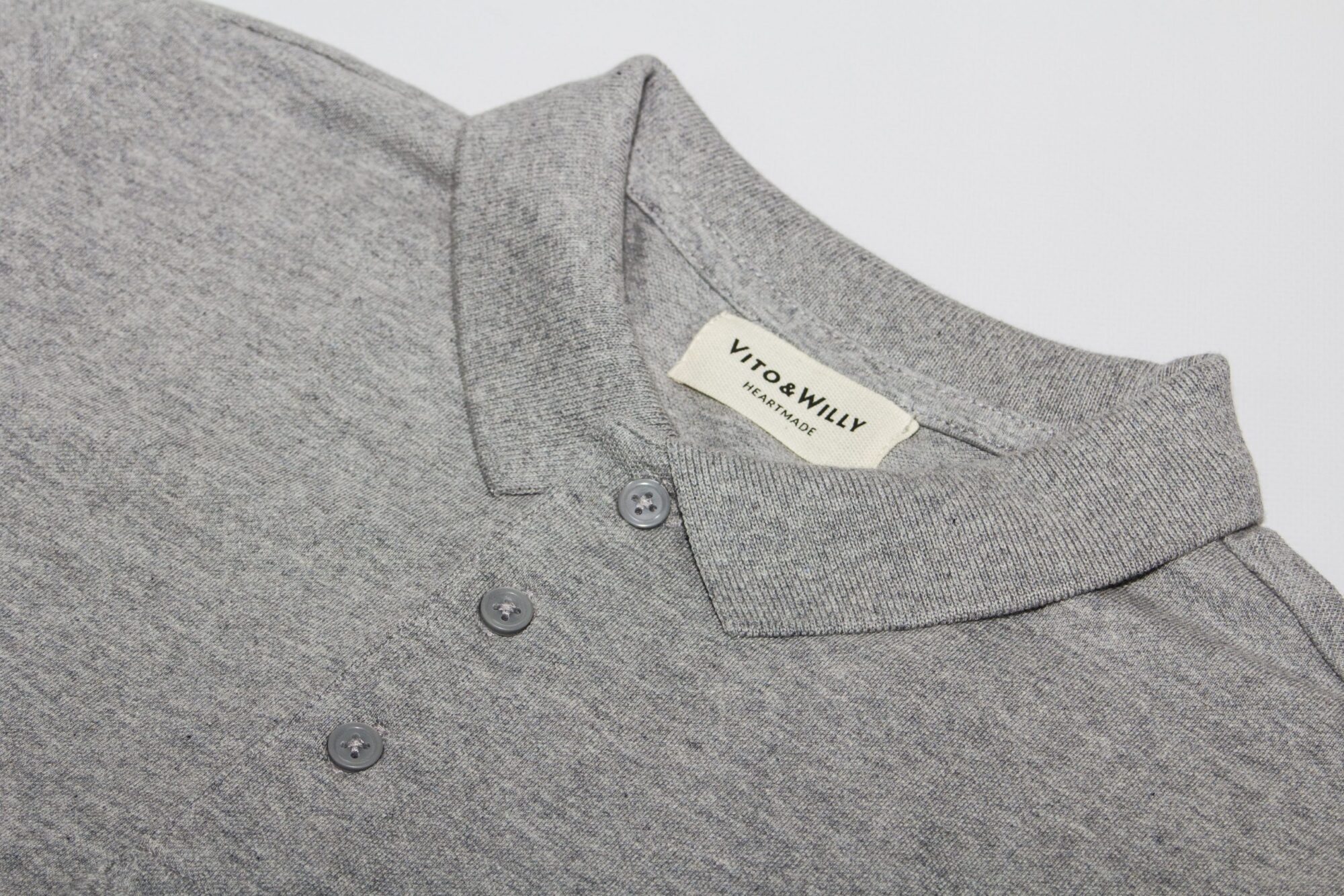
Logo polo shirts: 4 tips on how to create awesome custom polos
For many of us, when we think of a polo shirt it’s one which is emblazoned with a logo. The logo polo shirt is simple and understated, and it’s for this reason that many brands choose to get custom embroidered or printed polo shirts for their business. The custom polo a ubiquitous sight on most high streets, usually seen with just one block colour all over, with a logo on the left breast.
The other place you’re likely to find the logo polo shirt is in sportswear. Smart, but still with an easygoing air, the shirt has been embraced in sports for the same reason as it’s been adopted by brands. Boasting the combination of smartness with a loose, airy fit, it’s seen the shirt popularised in tennis by Fred Perry, where there was (and still is at Wimbledon, at least) an emphasis on keeping up a genteel appearance even as you compete at the top tier of elite sport.
But how to make sure that your own logo polo shirt is up to scratch? The simple things are often the hardest to pull off, and with plenty of other brands proffering their own examples, it’s vital to make sure that you get yours right. Here we offer four tips on how to make sure your polos are as good as they can be.
4 insider tips on how to create awesome logo polo shirts
1. You can use embroidery or screen printing
For polo shirts, it’s possible to screen print or embroider your design – but we’d generally recommend using embroidery for best results. If you’re really keen to screen print, we’d recommend using higher quality polo shirts to ensure you get best results (like those by Stanley Stella, for example.) In both cases, the minimum order is 20 units.
2. Keep it simple
Whether you’re using screen printing or embroidery, you’ll get best results by keeping your design simple. For embroidery, in particular, text and simple line graphics work best, and we advise to use a design no smaller than 50mm. In the case of logo polo shirts, it means that if you have a complex or super-detailed logo for your brand, then it would be advisable to adapt it. Bring out the key aspects for a clean and simple approach – that way, the finished product won’t have any issues with the embroidery.
3. Think creatively about embroidery
If you decide to use embroidery for your shirt, then it’s worth thinking about ways to toy with the medium. Compared to screen printing, there’s a tactile side to embroidery that can be interesting to play around with. For example, by using thread that’s the same or similar colour as your garment, it can create a subtle effect that will catch people’s eye once they notice it.
4. Consider using special threads
Another great thing about embroidery is the special, attention-grabbing threads which you can use for your design. These can come in a range of options such as neon or metallic. Of course, this depends on your brand identity and the style you’re looking to suggest, but it’s worth considering for a small splash of something different on your designs.
Want to create your own polo shirts? ICON Printing offer fast turnaround printing on a range of garments, counting a number of clients ranging from such as WeWork to Boiler Room and the Tate. Get a quote in 2 minutes online.
Tips and tricks
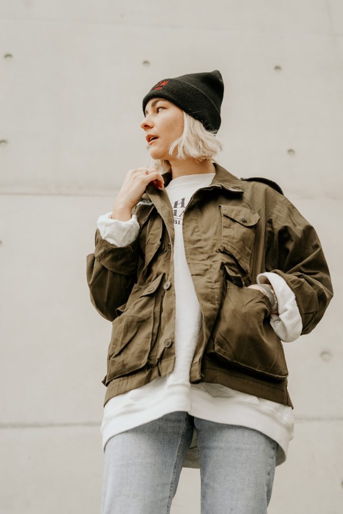
Custom jackets: everything you need to know about jacket design
A custom jacket is a rare, refined kind of garment. Brands or businesses creating a custom jacket are looking to create a unique, super-quality product. This means that’s important to get it right.
Similar to hoodies, a jacket is an item that can find its way into being an everyday mainstay. They’re usually one of the most pricey lines of clothing. By the same token, this means they can be adopted as one of the most highly cherished items in someone’s wardrobe.
What’s more, there are more likely to be issues with printing onto jackets, due to the different shapes, designs and designs they come in. So it takes careful consideration to make sure the product you create is up to scratch. With this in mind, we’ve pulled together our top tips on the pitfalls to avoid and the aspects to keep in mind when designing a custom jacket.
4 tips on how to design a killer custom jacket
1. Use a simple design
One thing to note about custom jackets is that it’s not possible to do direct-to-garment (DTG) printing. This means that your main options are transfer printing, screen printing or embroidery (or a combination, of course.) Whereas with DTG it’s possible to print photos and super-detailed designs, these other methods get better results with simple designs. So this is something to bear in mind when planning your design.
In many cases, clients we work with will supply their own jackets. This of course gives you greater freedom in the garment you choose to customise, but it’s worth bearing in mind how suitable the jacket will be for customisation. For example, certain details, like the lining or the pockets, can mean that it’s not possible to do screen printing. Additionally, we ourselves offer a big range of jackets, all of which are created to be used for customisation, meaning that you’re much less likely to have issues with the finished product.
3. Use the right kind of file
One small but important detail to remember: the file type you use when sending over your designs. For all of the methods that we use for jackets – that is, transfer printing, screen printing, DTG and embroidery – we ask for vector files rather than raster files. If you need help with this, we can usually offer a service to vectorise your design, so just get in touch to discuss.
As has hopefully been made clear, there’s a lot to consider when it comes to custom jackets. Perhaps moreso than any other merch item, there are many variables which can affect what’s possible – and, most importantly, what kind of final result you’re going to get. So we recommend getting in touch to discuss what you’ve got planned, as we’re always open to discussing orders and offering our input on what would work.
Want to create your own custom jackets? ICON Printing offer fast turnaround printing on a range of garments, counting a number of clients ranging from such as WeWork to Boiler Room and the Tate. Get a quote in 2 minutes online.
Loading custom options…
This website uses cookies
These cookies are used to improve your website experience and provide more personalised services to you, both on this website and through other media. To find out more about the cookies we use, see our Privacy Policy.
Functional
Always active
The technical storage or access is strictly necessary for the legitimate purpose of enabling the use of a specific service explicitly requested by the subscriber or user, or for the sole purpose of carrying out the transmission of a communication over an electronic communications network.
Preferences
The technical storage or access is necessary for the legitimate purpose of storing preferences that are not requested by the subscriber or user.
Statistics
The technical storage or access that is used exclusively for statistical purposes.The technical storage or access that is used exclusively for anonymous statistical purposes. Without a subpoena, voluntary compliance on the part of your Internet Service Provider, or additional records from a third party, information stored or retrieved for this purpose alone cannot usually be used to identify you.
Marketing
The technical storage or access is required to create user profiles to send advertising, or to track the user on a website or across several websites for similar marketing purposes.